
FELT Bakery
Brand Identity & Interior Design
Wimbledon, London · 2025
Completed SpaceA softer kind of neighbourhood bakery.
FELT is a neighbourhood bakery in Wimbledon, London, where the warmth of handmade bread meets a simple, contemporary interior.
Drawing on the softness of felt, the character of traditional craftsmanship and the idea of a welcoming community space, the project brings together brand identity, interior design and visual communication.
From the logo to the materials and the shopfront, each element was developed to give FELT a character of its own — familiar, inviting and quietly distinctive.
The Story Behind FELTA name rooted in softness and craft.
The starting point for FELT was a story of felt-making, connected to a factory with around 90 years of history.
Felt and freshly baked bread share an unexpected quality. Both evoke softness, warmth and the sense of something made with care. These associations became the foundation for a brand that feels approachable without losing its craftsmanship.
The ambition was to create more than a place to buy bread: an open, welcoming bakery that could become part of the neighbourhood's everyday rhythm.
Materials & AtmosphereIndustrial simplicity, softened by nature.
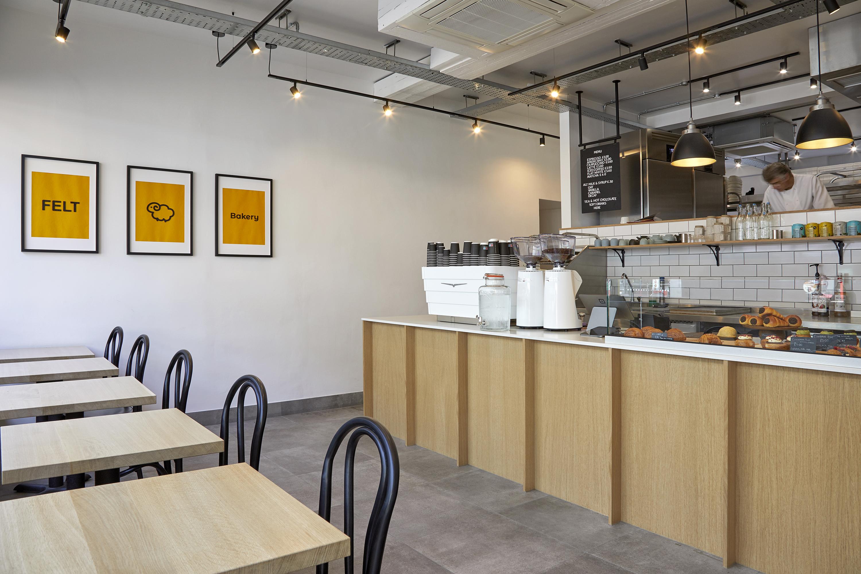
The interior concept, Cosy Artisan Bakery, brings warmth and comfort to the simplicity of Industrial Minimalism.
Natural materials, clean lines and carefully considered details come together to create an atmosphere that feels both contemporary and welcoming.
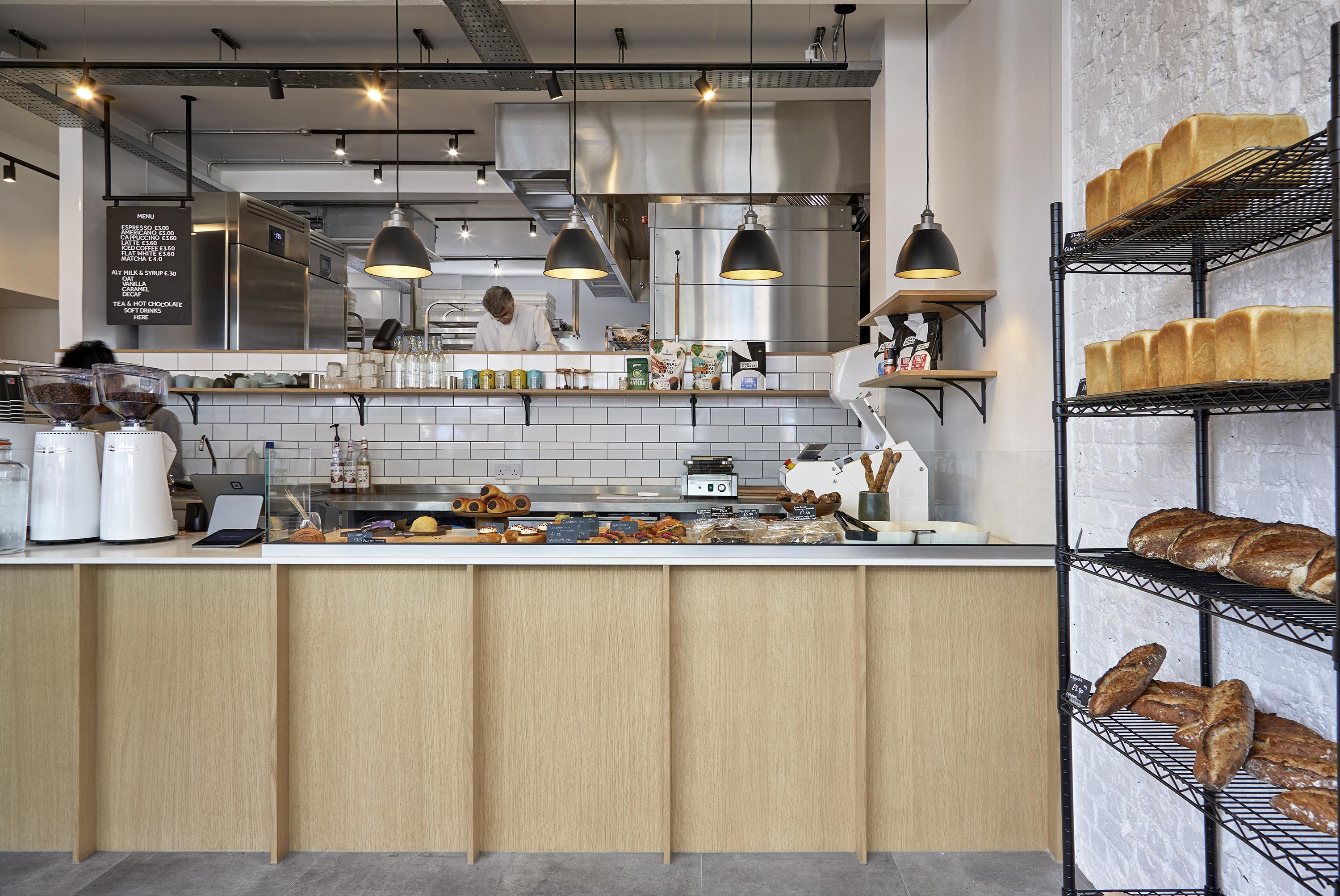
Oak joinery and furniture bring texture and warmth, while a quartz countertop and white walls keep the space bright and clean. Concrete-effect floor tiles and matt-black lighting retain a subtle industrial character.
Rather than relying on decoration, the design uses the contrast between natural and industrial materials to create a balanced and comfortable environment.
A Visual Identity with a StorySoftness, shaped into a symbol.
The FELT identity is built around two complementary elements: a distinctive wordmark and a symbolic mark inspired by a sheep.
The wordmark uses carefully balanced letterforms, with subtle rounded details that introduce softness without losing clarity or elegance.
The sheep symbol draws on wool, the raw material of felt. Its simplified, rounded form also echoes the softness of freshly baked bread, connecting the bakery's name with its everyday craft.
Together, the wordmark and symbol create a flexible visual identity — recognisable on the shopfront and adaptable to different applications, whether used together or independently.
Bringing the Brand into SpaceOne identity, from the street to the counter.
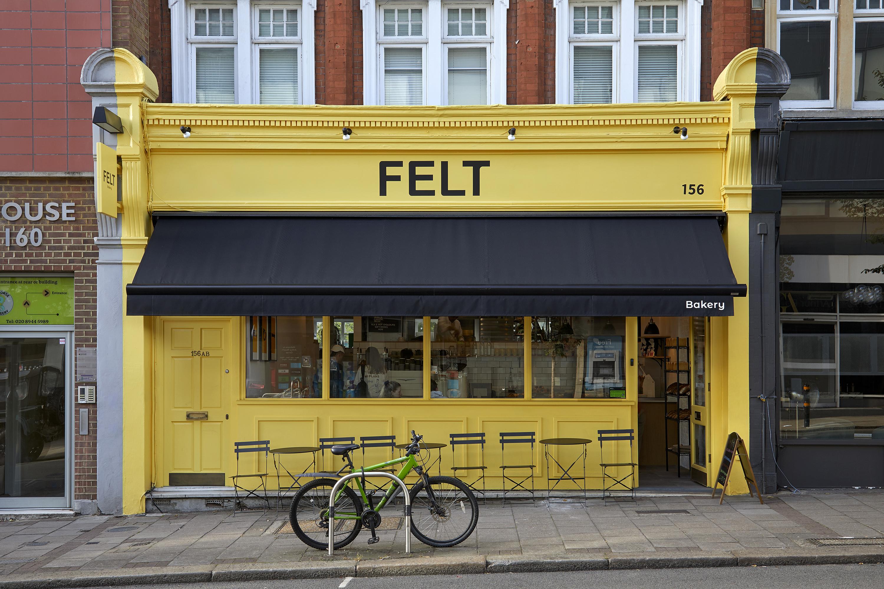
The design brings FELT's identity into the physical space, beginning with its first impression from the street.
A warm yellow shopfront gives the bakery a recognisable presence along Arthur Road, contrasting with the restrained black lettering and awning. The colour creates a cheerful and welcoming impression, establishing a new identity for the former restaurant premises.
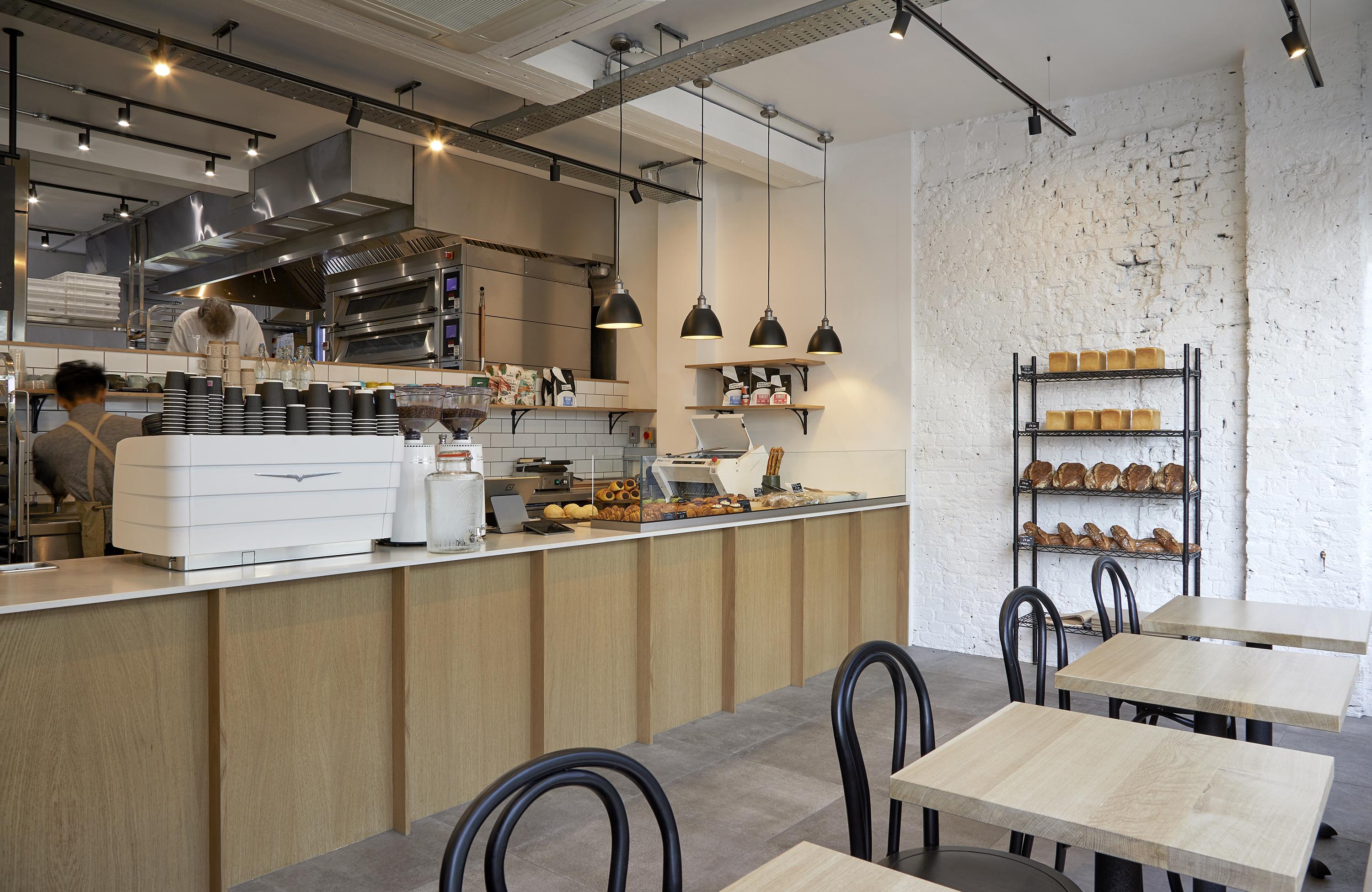
Inside, the atmosphere becomes quieter and more tactile. Oak surfaces, a light quartz counter, concrete-effect flooring and warm lighting create a backdrop for the bread and the people who come to enjoy it.
The layout brings together the bakery display, coffee preparation, counter service and seating, balancing the practical needs of a working bakery with the comfort of a neighbourhood café.
From Design to DeliveryFrom the first idea to the finished place.
A design only becomes meaningful when its ideas can be carried through into the finished space.
For FELT, the process connected brand research and concept development with material selection, spatial planning, detailed joinery design and construction.
The counter, seating, lighting and shopfront were developed as connected parts of the same environment, with attention to both the intended atmosphere and the practical requirements of the bakery.
The completed space brings these decisions together: a clear visual identity, considered materials and a working interior designed for everyday use.
Interactive spatial study
Prototype 3D study — illustrative geometry, not the original design model.
Drag to orbit · scroll or pinch to zoom · select model elements to inspect
The Finished BakeryMade for everyday moments.
The finished bakery reflects the balance at the heart of the project: softness and simplicity, natural and industrial materials, a distinctive identity and an inviting everyday atmosphere.
The warmth of oak, the clarity of the light surfaces and the cheerful yellow shopfront each contribute to FELT's character.
Together, they create a place designed not just to be seen, but to be visited, used and enjoyed as part of daily life.
Project Credits
FELT Bakery — Wimbledon, London, 2025
Design & Branding: DEIK
Construction & Fit-out: EDO Construction
Selected design work by Sato Saeki as part of the DEIK / EDO Construction team.
This project was completed before the establishment of Omurice and is presented as selected experience of its founder.